Chiltern Advanced Access stands out as a leading scaffolding contractor, specialising in the intricate processes of erecting and dismantling temporary metal scaffolding on various construction sites. This expertise not only facilitates other contractors' ability to work at height safely and efficiently but also significantly enhances overall project productivity.
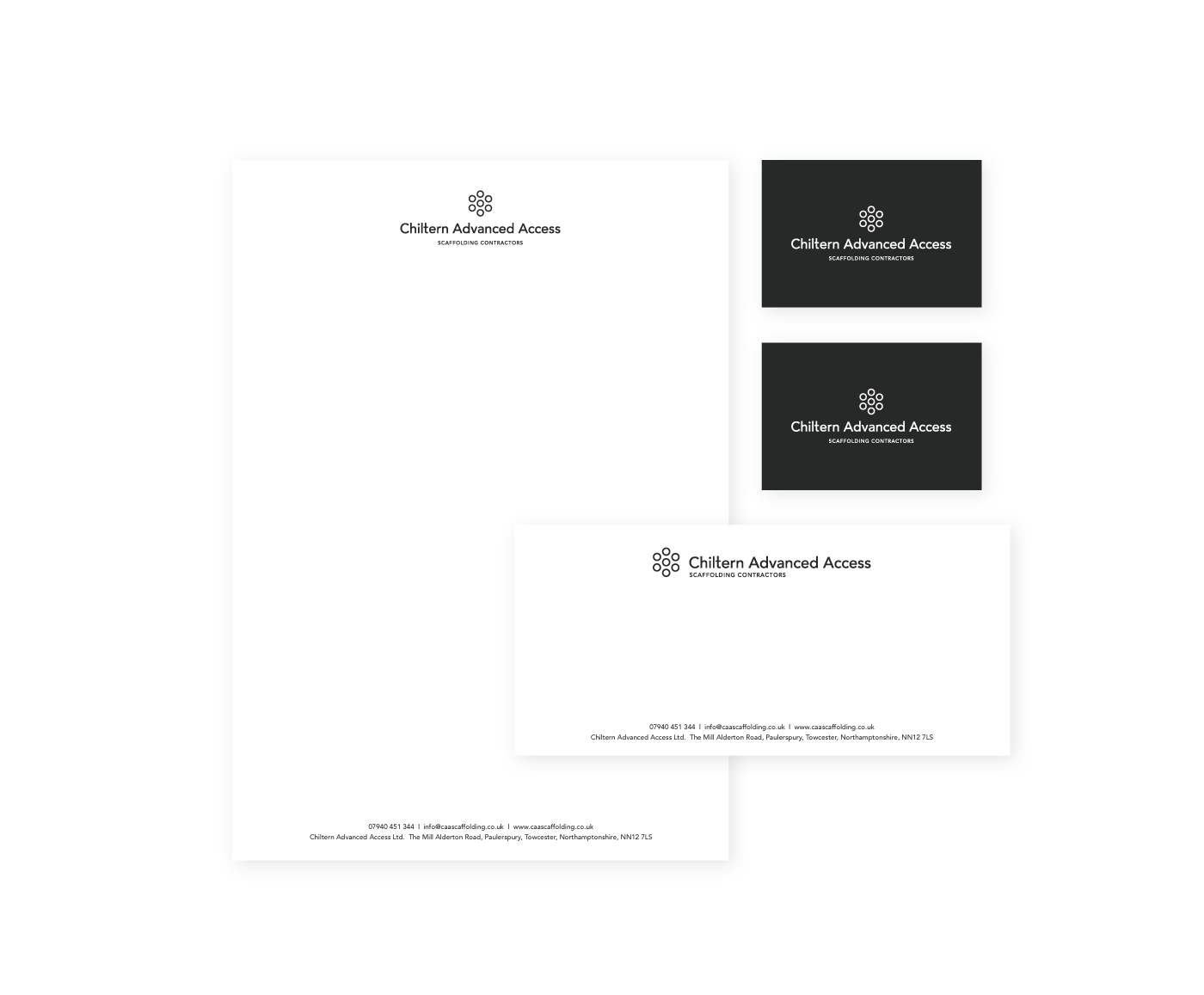
To elevate the brand identity, an original abstract symbol was uniquely crafted using the hollow ends of scaffolding poles, which were thoughtfully paired with the Avenir font. This font is widely recognised for its clear, legible rounded characters, establishing a seamless connection between the symbol and accompanying text. Together, they create a cohesive visual representation. The logo, with its clean lines and almost corporate aesthetic, effectively conveys a sense of trustworthiness and reliability—qualities that are invaluable in easing contractors’ decision-making processes within the competitive landscape of the industry. Through this branding, Chiltern Advanced Access not only asserts its professionalism but also reinforces its commitment to safety and quality in every project undertaken.